60–30–10 Colour Rule
This is a general colour guideline which helps designers understand fundamental design rules and how to incorporate colour within it.
This rule basically helps us to understand the balance between the colours we are going to use in our designs.
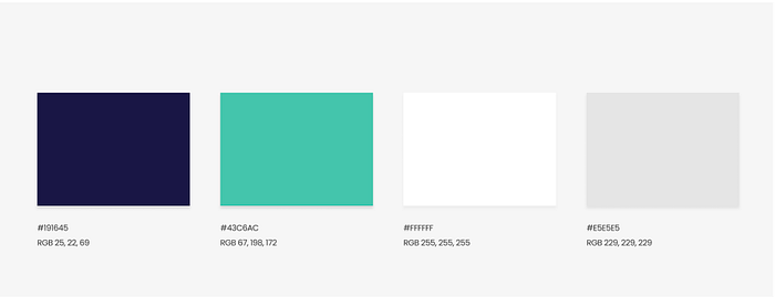
Below i have used an example to show case the rule and how we can learn from it and use it in our application.

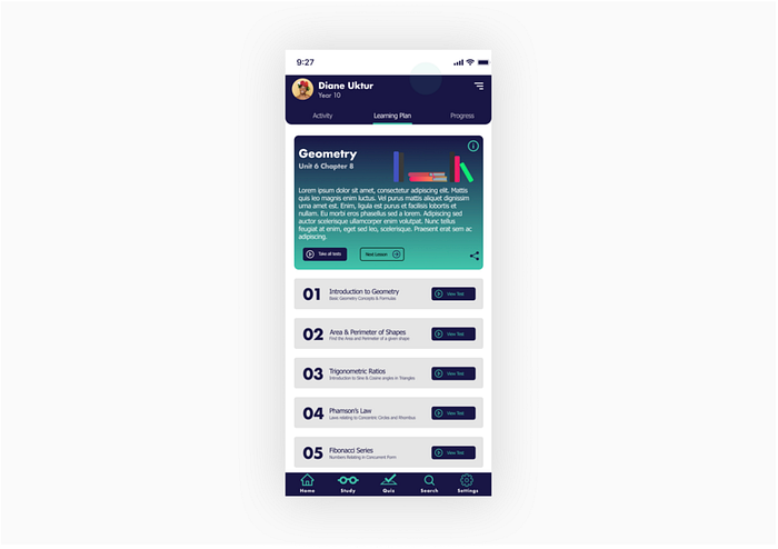
Now using these colours the designer has created an application which is an — Exam study app.

Now according to 60–30–10 rule,
60% — Dominant hue ( Neutral Base colour)
30% — Secondary Colour
10% — Primary Colour (Accent colour).
So, the idea is to breakdown the whole colour palette into 3 parts which helps us to create a well balanced coloured application.
Here, we dedicate 60% of the colour palette to the Base colour or Neutral colour which helps the other two colors to get proper contrast to it.
30% of the color palette needs to be a complementary color and can be used as the secondary color for the project.
Rest 10% of the color palette goes to the primary color. This is basically the color that goes to all the CTAs. This is the compelling color on components which brings the interaction from the users.
This works because its easy to use and helps the eye to move from one focal point to the other seamlessly.
Here’s the improvised design with use of the 60–30–10 color rule:

What changed?
- Adjusting to the color palette and using 60% as white, 30% as blue and 10% as green.
- Removal of the Name, photo and date as they were not useful in the context of the screen.
- background gets the white color
- The big tile gets a solid blue instead of gradient as before.
- Changed color of the grey tile to white and added shadow to it.
- Lastly, used primary color over button, tab bars, icon etc.
The new screen we get is more cleaner, with well balanced colors and lot more appealing to the eyes.
Use of color can make or break our design. It can give great experience to users or can leave them completely confused. There’s also the middle ground but the point is that with the use of colors in a very structured ways gives us the power to drive the user into certain motion which helps the user navigate through the application seamlessly.
